


As one of the final editions to the scene, I added a mirror above the fireplace. Making the mirror was just a way of making the room look less bare, as well as a way of avoiding to paint stone walls, which I did for the Church of Sarenrae and was more time-consuming than it was effective.
When making the mirror I had to make the decision of whether or not it would reflect the rest of the room which faced it, or just give the illusion of a reflection which had gotten distorted. In the end, I figured it would be best to just leave it as the second option, ultimately meaning that I could still make it seem like an actual mirror without spending time making up furniture for the room.
Prior to this I had already made an overhead plan, too, but I didn’t think there’d be enough room left other than more tables. Even still, anything seen in the mirror would be in pretty thick shadow, so I’d then face the challenge of trying to make sure that you could tell what I was drawing without it being totally visible.

I know that it’s not very impressive looking at the first image, actually it looks kinda messy, but this was just the block colour of everything. The glass has a little bit of a blue-y tint to it as I find that when you look at glass side-on it turns a little bit green – both mirrors and windows. It may not be completely accurate, but the only reference I could find for this was mirrors with clear reflections on the internet, so I resorted to using my own observations.
Looking at the quality of it, I wasn’t too bothered about keeping the mirror very neat when painting it as I knew that it wouldn’t be seen to well. Having it put above a very bright fireplace in contrast with a very dark room, I figured it’d have a very strong shadow cast on it.

Above, I’ve added a reflection to the mirror, to show at the very least what sort of surface it is. A matte surface such as a brick wall or a carpet wouldn’t have an shine on it whatsoever and would probably have shading, whereas a mirror has a very smooth, shiny surface, so I tried adding a bit of gloss to it.
This was done sampling the blue-grey colour of the glass and getting a few shades brighter than that, before applying the airbrush tool and making zigzags anywhere and everywhere on it. Managing to create the sheen of the mirror was a bit difficult to get my head around at first, until I had the idea of downloading a brush pack called ‘Jackbox’, which included a watercolour brush which was just water.
Initially, I was expecting it to act very similarly to the smudge tool in the way that it would just push the colour around a bit and just cause a lot of issues for the program (as it always does), but it didn’t. Instead, it left the existing colour alone and dragged more of the same colour out of it, letting it fade away gradually, if that makes any sense. I found it to be much more useful than the smudge tool at least. Lastly, I decreased the strength of the blur tool to around 40% and just ran that across the area a couple of times to finish up.

Remembering that the shadows cast on the mirror would be heavy due to it being placed above the fireplace, I thought about adding a further dark green tint to the whole of the mirror, including the wood.
This part was easy. To make this possible, I covered the entire mirror with a teal colour on a separate layer, set that layer to multiply and lowered the opacity to 70%. Thinking about the mood that this would reflect in the room overall, as well as the presence of the shadow filling from the right hand side of the room, I felt like the green gives an eerie element to the room.
It was completely unintended to work in that way, but I’m happy I did it. When Tony suggested to add the shadows I thought it looked quite creepy and uneasy, where the idea is brought up again by the ominous colour of the mirror.

Last but not least, I added a little bit of lighting. Originally I used the gradient tool to add a white to transparent colour from the top to the bottom, but I don’t feel like that did the trick. It took a few attempts to be convinced that all I really needed to do was add and blend the colours in myself, to show where the light is centred from.
On the same layer, highlights were added to the extruding parts of wood on the sides of the mirror, to show that there is some decoration on it. The fact that the mirror was hidden in the dark didn’t really emphasise this part. This entire layer was put on overlay to both brighten and lighten the colour I’d applied.
Summarising everything I’ve done with the mirror: it could be better. It’s only when I’ve went into detail breaking down the process of making it that I realise how I was being quite lazy. In fact, I was thinking to myself for the time I was writing certain parts of this post “you could have easily used (x) tool to make it do (y)” or “you know that there’s a better way to do that it just takes a little longer”.
Seeing that this is a pretty small asset in my eyes, I’m probably not going to recreate this one or edit it, as it is pretty hidden from everyone else. But this is definitely something to take into account for the rest of the assets I have to make.
About halfway through into finishing Jonah’s Tavern, I’ve met the most difficult challenge so far: the rug. At first, I thought it was going to be a good chance to show that I’m capable of managing fine details, like painting different fibres to show which materials make up the carpet. But no. This was easily the asset of the room I’d attempted a good 10-15 times until I was finall happy with it.
That’s not to say that I only stopped attempting because I couldn’t be bothered, however, I perservered until I thought it to be presentable and up to the standard of everyone else’s work. Even if I don’t think it’s my best work, I still think I’m my harshest critic, and it’s the best attempt I had made of it. The thought of a deadline in 4 weeks time was a good motivater, too.

Just like everything else I’ve done so far, I’m trying to split up different parts of the asset into as many layers as I can to prevent making mistakes that can’t be undone. Starting off with deep reds and blues, I used the line tool to create the straight edges of the rug. You’ll probably notice on the left hand corner that I mess up the line a little bit, but instead of spending ages trying to even it out, I though it would be a good idea to leave it and adjust the rest of the carpet to make it look like the carpet has lifted slightly.
It was important to capture the right perspective, too. Ideally it was supposed to get slightly wider towards the end, as if the angle was from someone standing in the corner of the room. This is one of the parts I wish had turned out a little better, but it’s not miles off.

Having done that, there was another layer added to add all the decals. This was done partially with the help of a few pictures on Google Images, but mainly with my own ideas. Looking through a few of my previous art pieces, it’s obvious that I don’t really have much experience with medieval furnishings, so Google came in handy to give me a good idea on different patterns I could use.


From the images above, you can see that I’ve tried to use elements of the floral and arch embroidery. As I’ve noticed, there’s loads of very rich colours in Medieval furniture, and especially in the rugs, floral inspirations. If I could have a guess, I would say that things like fruit or plants were signs of wealth in that era, so that’s why I’ve been trying so hard to implement them in my work, too.
I’m not thrilled with the decals of the golden arches (???) along the blue section of the rug; they’re not very tidy and really I just put them there to fill space when my brain ran out of ideas. Therefore, I think they look kinda spaced out and unnecessary. The ball was dropped at around that point for me, but I had more important things to focus on, like getting everything else finished.

…and here’s the final thing! In my final layer for the rug, I carried on the lighting started by the fireplace and used the watercolour tool to even it out. Honestly, the watercolour tool has been a godsend and I’m so happy Rachael introduced it to me as (for as long as you keep it clean) it is a much more efficient way to blend colours, unlike using the smudge and blur tools, which I was doing.
What I did for this was apply a cream colour to the brush and press heavily at the point I wanted the colour to appear more dense, and just pressed gradually lighter as the light would disperse further away from the centre. I feel like it worked well, and will definitely use this tool as an alternative from now on.
Only thing I would change is adding that little bit more depth that some rugs have, where some fibres are thicker and therefore slightly higher, creating a very small shadow, but I would have no idea how to go about that knowing what I know now. This is something I’m going to change when I adjust the levels and make finishing touches to my piece.
UPDATE: It’s been about 4 days since I finished this asset. Re-reviewing it again, I think I was being a bit harsh on myself at the beginning of this post, where all I needed were a fresh pair of eyes. It’s not perfect and will be altered, but I’m happier with it than what I was before!
So, making this fireplace took way more effort that I had first anticipated; it was one of the first things I’d completed in this piece and has been done for a while, actually. On completion, I’d managed to use 22 different layers to finish it up, so instead of going through each individual layer, I’m going to sum up each main element of the fireplace, as the layers only had an impact when they were all put together.

The first thing I thought to do was add some block colour. This meant I coloured in where the flame would be going with yellows, oranges and browns. Likewise, I coloured in the cement of the structure before adding the stones. Next, I smudged the colours softly upwards from where I’d put the centre of the fire and blurred it so all the colours blended smoothly into each other.
After all of that, I painted in parts of the fire that didn’t have to be blended, such as the burning wood and the metal stand on the inside. Thinking about how wood and metal starts to glow orange when they burn, I’d coloured them in with different orange colours instead of browns and greys.
Finally, the last thing to do was to add some ash on the bottom on the fire. This was done by finding a brush tool which, when applied in dots, looked like ash from the wood. It looked too fake after coming back to my computer after a break, so I decided it would be better to blur that too, slightly, which I stuck with.

Moving onto the outer fireplace, I painted in some stones in block colour with a reference. Thinking about the positioning of it, I wanted the fireplace to the built into the wall instead of protruding from it, so I made sure to leave a gap for the cement to bridge the space between the stones and the wall.
I used beiges, pinks and olive-y colours to get some variation, as no stones are really the same colour. It was also important to me to keep the colours warm so that they would match the warmth I’m trying to give to the room.

On a separate layer, I applied an air brush and went over the stones in a dark brown colour. There was very little technique used here actually because all I did was literally add squiggles on the stones where the light would maybe not catch the stone, like along the opposite edges. I did this because not every stone is even on the face, so some parts will catch light and similarly avoid it, too. There’s also some lines which are sharper than others to give a better idea of the depth.

To show you the highlights, I made sure that the shadows layer was hidden. All that I essentially did for this one was the exact same as what I did for the shadows, except with a lighter, warmer colour than the stones. I drew the highlights using the shadow layer for reference, so that the light wouldn’t catch the same parts that the shadows are catching.

Put together, the lighting came out something like this! The texture the basic highlight and shading makes has a much bigger impact than I first expected, and it came out much more realistic.
Once you see everything complete and together, there are some things I’m proud of just as much as I wish I had done differently. For example, I’m really happy that the art style closely mimics Chloe’s art style (which I’ve been practicing on, as my non-realistic art style differs from Chloe’s quite a bit), yet I’m sure Chloe didn’t achieve her finished art by relying solely on the blur tool, which I admittedly did.
As with a few other things I’ve done, too, I’ve also neglected to emphasise the brushstrokes on the details, which was probably lost by bluring so much. To fix this in the future, it might be worth trying to lower the opacity of my paintbrush slightly and go over certain bits a few more times to create the appearance of brushstrokes similar to those you’d see in traditional art. It’s just an idea for now, but we’ll see how it goes.
Progress is being made slowly but surely on Jonah’s Tavern, although that’s only because I’m focusing on precision and attention to detail more so than my other projects. One of the things I’ve really enjoyed doing in this piece has been the bear head mounted on the wall as it’s helped me to learn loads of different techniques to experiment with in the future.

When I was younger and just starting out with digital art, I used to love drawing animals, but more so cartoon-style dogs and cats. This normally included drawing the outline of the animal and just colouring it in; never usually paying attention to the texture of the fur or anything. Painting this bear helped me learn how to use different paint tools and opacities to create the appearance of fur I’ve never been able to do previous to this. With a fine, solid brush tool, I added some brush strokes in flicks directed away from the nose in a lighter colour than the base. After, I did the same thing just with a darker colour to create the shadows, which added depth to the fur.
For extra detail, I also tried adding some fur in a lighter colour around the edges of the lips, using a reference as a guide for this part to see how dense the fur should be around this area. I didn’t use this technique for the main body of fur as it is a darker colour than the muzzle, and any detail I added wouldn’t be seen too well (as I’ll explain in a later blog post).

When taxidermists work on their animals, they replace their eyes with glass ones. With this in mind, I didn’t feel like it was enough to just make a gradient of colour for the eyes as real glass eyes would have a shine to them, or maybe a reflection. After making amber with an orange to yellow gradient, I added some white areas and smudged them in, before blurring them.
Looking back now, I feel like I should have added some shading to the upper part of the eye, which would have been casted by the eyelid or maybe the huge shadow to the right hand side of the bear (which you can see in the full image).

I was super proud of the shine I made on the mouth and teeth! It was a very similar method to how I made the shine on the eye, as I just gradually lightened the colour around the highlighted area before feathering and blurring it. The only difference I did was with the lips, where instead of just lightening the colour I also made it gradually bluer. Using reference again for this part, I realised that the nose and the lips of bears are so dark that they give off a blue-ish light, so I tried to replicate this as much as I could. Overall, I was really pleased with how it turned out above the other parts I did.
Knowing now how to paint animals with more detail than I did previously, I would definitely use more than one layer. Normally in everything I produce, I make sure to use as many layers as possible to avoid having to start over because I changed my mind on something, or in case I ruined another part that cannot be undone by mistake. I wasn’t expecting to like what I practiced with so much, so I didn’t really expect to keep everything I did on the one layer. It’s definitely something to bear in mind in the future.
Although never having played the game myself, I have watched others master it and have watched different interpretations and reactions to the game as well. ‘Cuphead’ was the cutting-edge game of 2017, having received amazing reviews and public reception for it’s innovative 1930s cartoon-style art, animation, music/SFX and every other detail.
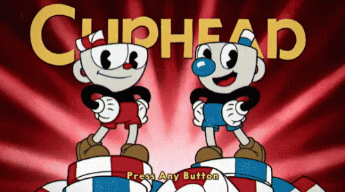
Before I talk about the influences game creators Chad and Jared Moldenhauer used within the ‘Cuphead’, I feel like it’s important to give a bit of insight into the art style itself. As seen from the GIF of the title screen above, ‘Cuphead’ immediately gives the impression of depression-era style cartoonism of 1930s America. Having grown up on watching and loving older cartoons such as old ‘Looney Tunes’, ‘Tom & Jerry’ and ‘Mickey Mouse’, it’s without a doubt before you even start the game how this will be heavily influenced by cartoons of this time. Whereas many games of today are trying to steer away from the clunkiness or outdated thick outlines and 2D animation, ‘Cuphead’ brings it back in a very stylised fashion, which I admire.
 [Puss n’ Booty – 1943 Looney Tunes Opening Title]
Although the image above of the Looney Tunes title card isn’t a GIF, you can still tell by the screenshot that the Cuphead start screen and the Looney Tunes into both share very, very similar qualities, just like many cartoons of that era. They both share film grain (where ‘Cuphead’s’ film grain is clearly artificial for authenticity throughout the game), heavy uses of shading in the background, and characters with thick outlines. Another thing I’ve also noticed is that vintage American cartoons all share the common feature of very bold text wherever they’re placed, which are very easy-to-read fonts as well.
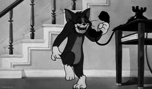 [A 1930s episode of Tom & Jerry, which I was unable to find the name of]
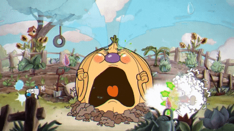
 [Cagney Carnation boss battle in ‘Cuphead’]
Just by making my own observation, I’d always be able to identify the main difference between a vintage cartoon and a modern (early 00s at the time) cartoon by looking at the background (see the two GIFs above). Obviously, I’ve gotten older and more aware of the advancements in technology since then. I realised that cartoons I used to watch from the 1930s-1960s would have been hand drawn, frame by frame, which as you can imagine would be pretty tiring after the first 5 frames in itself. I’d never questioned the reason why the background on older cartoons were much more detailed and much more static than the newer generation of cartoons. Looking back now with a clearer understanding, it’s easy to explain this as a way where the background appears more detailed because the thing(s) being animated has little to no detail on it whatsoever, to save the animator time when the entire cartoon is being hand-drawn.
The fact that Cuphead replicates this style in the game is amazing; it really keeps in time with the nostalgic, old-fashioned theme it brings forward throughout. On top of that, I read that this was hand-drawn and animated frame by frame just like classic cartoons, which just makes it feel all the more authentic.
When talking about the Moldenhauer brothers’ influences on the entire game, they drew it from cartoons from the likes of Paramount Pictures to the likes of the lesser known Fleisher Studio projects in order to create new characters from long lost aesthetics.
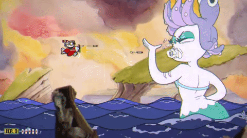
Cala Maria seems to be a flirty and vivacious being who seems to have some type of interest in Cuphead and Mugman, as seen in her intro where she makes a sweet “yoo-hoo!” sound while fluttering her eyelashes and making a pose. According to the Moldenhauers, this character has influences from both Betty Boop and a mermaid character from the Super Nintendo game ‘Gokujou Parodius’.

With the reference to Betty Boop, an iconic cartoon character from the depression-era, you can really draw similarities in the art style. For this time period, there seemed to be a lot of attention in hyper-feminising women characters. In this instance, both Betty Boop and Cala Maria have a really emphasised feminine figure, as well as heavy make up. I feel like in ‘Cuphead’, however, these features of old-style cartoons are used tastefully. Their body languages are both very sleek with a lot of curvature to them, too, as Betty boop (in this GIF) sways in a figure eight, where Cala shakes her hips in a similar way.
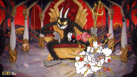
Much like many depictions of Satan, the Devil is a cruel and malevolent being that grants deals to anyone who asks in exchange for their soul and servitude. He can be a deceitful trickster as well, turning Cuphead and Mugman into his slaves despite agreeing to spare them if they hand over all of the soul contracts. He also lacks empathy towards everyone, including his own minions, as evident by him calling King Dice a “good-for-nothing lackey” after he has been beaten.
The Devil’s main trait is that he is incredibly prideful of himself, believing he’ll always win in the end as he brushes King Dice off when the latter tries to warn him about the brothers becoming stronger.
The Devil from ‘Cuphead’ was majorly inspired by an old Disney (Silly Symphony) cartoon called ‘Hell’s Bells’ released in 1929. The very clear observation to make here would be that both of the devils appear as tall, black creatures with details of a ram. In cartoons of this era, artists seemed to always draw fur as jagged, spikey slopes around the outline of the character, which is also reflected in both the game and in the cartoon I’ve provided the link to. As well as visually, the character both display very similar personalities; very prideful and lacking empathy. Seeing that in 1920s/30s America religion played a greater part than what it does in the modern day, the fact that the devil has such a similar personality to the older style could relate to that time in America in a way, just to keep up with the art style.
Bibliography
TBC
Seeing that I haven’t spoken about any of my own personal stuff yet, I want to dedicate this post to a couple of the art pieces I’m working on for the synoptic project. This week has shown me that it’s really difficult to work between two different art softwares (Photoshop at college, Krita at home) as neither share a file type I can use on my personal laptop. To get around this, I’m planning on focusing on one piece of art at a time and returning to the other at a later date and putting in extra hours at college as I’m really not liking Krita so far.

That being said, one thing I do really enjoy about Krita is that the brushes are really realistic and will give you the effect of what the brush describes it to be. It’s perfect for sketching in my opinion as I use the HB pencil which really does feel like you’re using a pencil as the brush has a low opacity and feathered edges.

In order to help me sketch out a scene, I press down heavier over the lines I want to be seen with the HB pencil tool. Just as it is in real life, the 2B pencil is thicker and therefore appears chunkier and darker on the digital art canvas, so I tend not to use this one. Lines that are lightly drawn represent drawings that I’m not sure I want to keep but are there just as a guideline.

Right now, I’m in the process of just adding some block colour to the scene. This is just to give me the general idea of the colouring of everything, where the plan from then is to just neaten it up

I’m not going to lie, I think progress has been a bit slow in the group lately. While I know it won’t stay this way for long, it seems like everyone’s motivation has just left lately. Chloe seems to be have working non-stop though and we’re all super proud of her (and are just as ever envious of her amazing artwork). Even still, there’s still plently to mention for this week as a whole.
Starting with Trello, it seems to have turned into the platform we use for generic tasks rather than each asset we have to do individually.

Ignoring the first note on the left hand column which was made before we knew you can’t delete stickers, the rest of the tasks are neatly organised (thanks to Rachael) and have been assigned to different people/catergories where applicable. Most of these tasks aren’t for anybody in particular and are either deadlines or reminders, for example, the next deadline for us is the progress crit on the 16th of April, which is in it’s own little section in the second column.
Like I said, we don’t really use this anymore other than for generic tasks or for reminding ourselves of deadlines. It’s good for people who want to add notes on the left with any questions they have and can’t reach anybody on any social media we all have, but even still, we have our own Discord group for that now. We use it as much as we feel like it is necessary, and it works more for some than what it does others, but most of us just leave it open when doing work just on the off chance that someone adds notes/new tasks.
We finally got our style guide, too! This means that we’re all able to start producing some final products, which is great because we’ve been waiting for this for ages as it’s all been really up in the air as to who’s art style we’re copying. As Chloe’s art style seems to be more realistic, Ebonny has instructed that we use Chloe’s techniques when creating our artwork. This includes adding visible brush strokes to make it seem more traditional as well as adding blur and focus to separate the background from the foreground a little more.
Scrums have been up to date so far, with a frequent scrum meeting at the start of Rachel’s Monday lesson every week. Depending on who’s the scrum master of the week depends on who is taking down the notes, but I think we’ve done a full rotation now. Nothing much has changed from the last week as everyone must be just trying to get large chunks of work out of the way before designing layout for the artbook or beginning the animation.
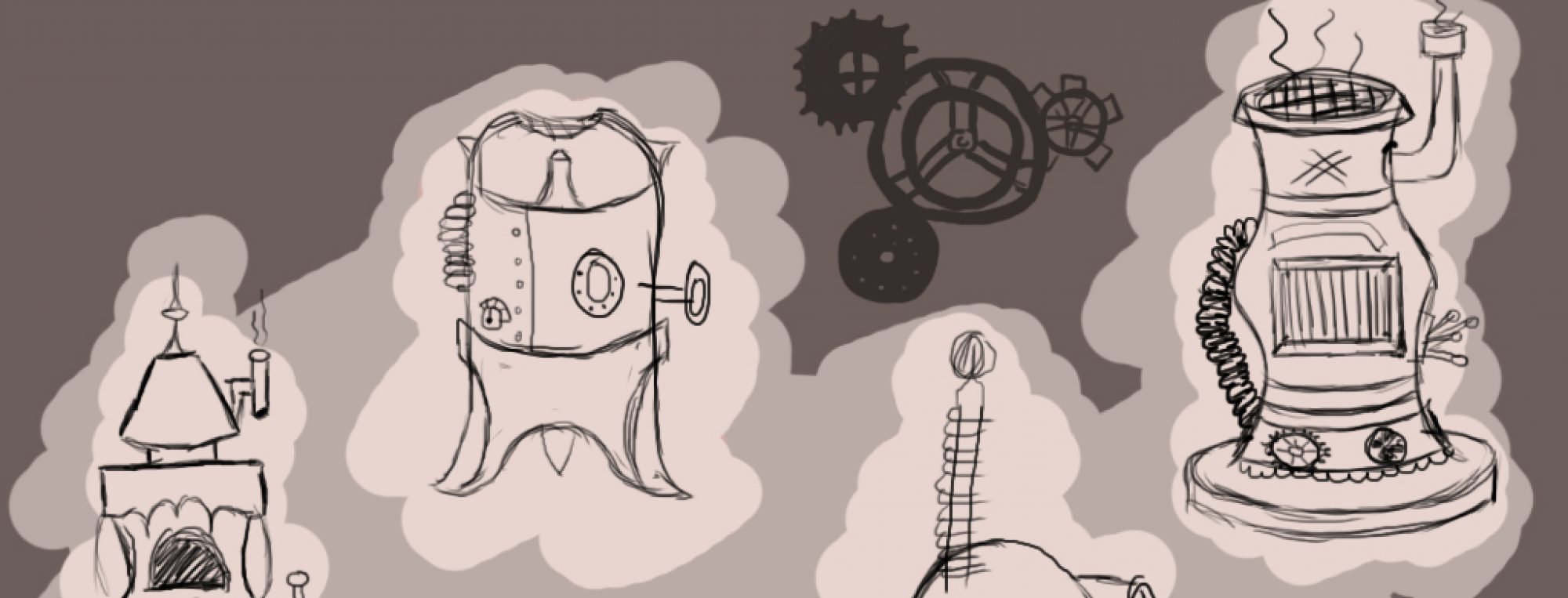
The final sketch I made for the concept art was for Ye Olde Lidl™. This one was left purely to my own imagination as Ebonny gave me permission to base it off a real Lidl supermarket, only with a *slightly* different name.

In all honesty, there’s not much to say from an artistic aspect about this sketch like there was for the other ones. I suppose I tried to keep the straight lines to show that this is more modern and futuristic compared to the other older, more slumped structures I’ve made.
The group all agreed that there should be a more comedic sort of setting; so when Ebonny said that she wanted a grocers, we came up with the idea of “imagine if there was a Dungeons and Dragons Lidl”.
As to what the layout of the interior should look like is well beyond me still. I’m unsure as to whether or not I should maintain the whole modern style to everything and alter it a little or just go all-out middle ages on it. I’d like to think it would be possible to make a spin off version of Lidl, but with the trolleys being replaced with baby dragons carrying baskets or with the prices in shillings or something like that, but I’m sure that’s a bit over the top.
When creating this one, I’ll have a lot of fun practicing techniques needed to make a glass effect on the walls. For the sketch, all I did was add a lighter shade of the lilac and just smudged/blurred it, but I know I can do much better than that if I just play around with the tools a little more.
I’ll need a lot of guidance from Chloe for this piece as I’ve only seen her artwork of natural landscapes and architecture, but never anything more modern. Seeing that we’re all supposed to be mimicing her artstyle, I can imagine it’ll be difficult to comform to her style for this one, but definitely do-able!
All in all, I’m expecting many, many mistakes and resets to get this one finished, so it’ll probably be either the very first one I attempt or the very last one, depending on how confident I’m feeling using all the software and how long I’ll need to adjust to different tools and settings to create the look I want. There’ll be quite a few updates on this one in the coming weeks.
The second sketch I made towards the pre-production was the interior of Jonah’s Tavern, which again was another practice with using gradients for lighting as well as other textures.

This, as well as the others, was made using Photoshop CC in college and took around 2 hours to finish up after playing around with different tools and brushes. All in all, I was trying to create a warming atmosphere around the room with a fireplace, a few candles and some torches hanging from the walls. Although I was still leaning towards yellow colours, there’s a lot more neutral tones like browns and some greens that I’d like to replicate in the final product.
So, even though its been 7 years since it’s release, I’m still really into Skyrim, the rest of the Elder Scrolls series is great but I’m still really in love with Skyrim out of all of them. My artwork has been very heavily influenced by architecture and folklore found in Skyrim lately, and Jonah’s Tavern is a good example of this.
I’m trying to get the feeling of a medieval Britain/old Nordic inn with the stone flooring, wooden pillars and open fireplace to name a few things. Ebonny said that out of anything, she wanted the main feature of the room to be a long dining table in the centre, but I don’t feel like I’ve captured this very well in the perspective that I’ve taken so I want to do another sketch later to show it’s size compared to the room.
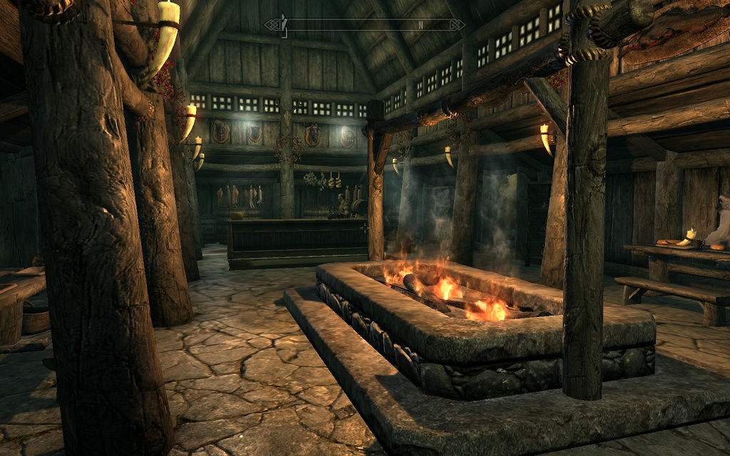
Looking at the inn from Riverwood in Skyrim, you can see the food and drink stored behind the bar. I contemplated having the hanging rabbits and pheasants to keep up with the theme, but I thought it may have been a bit too much for the U-rated theme we’re maintaining, so instead I put a bear mount on the wall to make it a little less sinister.
In case it’s hard to tell, I tried making a stone slate wall on the main walls you can see. Seeing that this is just a basic sketch, it’s not very detailed at all, but I just added some light grey and dark grey brush strokes to show that the light is hitting off some sharp edges on the wall. The method I used to create the sketch was very similar to the Church of Sarenrae, just using different colours, instead.
Once the characters have been added, it should look like they’re all there to have a good time rather than serious meeting, or whatever. I might include a place where the characters could put musical instruments like lutes or drums to show that this is supposed to be a happy place to be.
When doing the final concept, I’ll probably add some carpets or rugs to the floor, reasons being that it will stop the floor from appearing too cold and I really want to play around making woolly textures. Shading them should be a bit of a challenge, but hopefully I’ll get the hang of it once I find a suitable brush.
