Vallake Guide: w/c 19th March

I’m not going to lie, I think progress has been a bit slow in the group lately. While I know it won’t stay this way for long, it seems like everyone’s motivation has just left lately. Chloe seems to be have working non-stop though and we’re all super proud of her (and are just as ever envious of her amazing artwork). Even still, there’s still plently to mention for this week as a whole.

Starting with Trello, it seems to have turned into the platform we use for generic tasks rather than each asset we have to do individually.

Trello1.PNG

Ignoring the first note on the left hand column which was made before we knew you can’t delete stickers, the rest of the tasks are neatly organised (thanks to Rachael) and have been assigned to different people/catergories where applicable. Most of these tasks aren’t for anybody in particular and are either deadlines or reminders, for example, the next deadline for us is the progress crit on the 16th of April, which is in it’s own little section in the second column.

Like I said, we don’t really use this anymore other than for generic tasks or for reminding ourselves of deadlines. It’s good for people who want to add notes on the left with any questions they have and can’t reach anybody on any social media we all have, but even still, we have our own Discord group for that now. We use it as much as we feel like it is necessary, and it works more for some than what it does others, but most of us just leave it open when doing work just on the off chance that someone adds notes/new tasks.

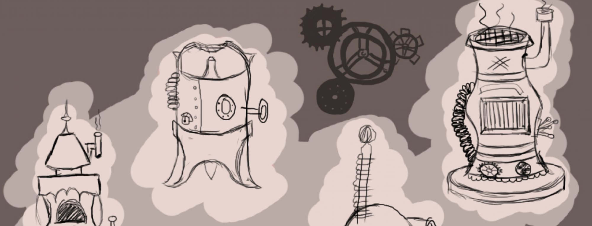
We finally got our style guide, too! This means that we’re all able to start producing some final products, which is great because we’ve been waiting for this for ages as it’s all been really up in the air as to who’s art style we’re copying. As Chloe’s art style seems to be more realistic, Ebonny has instructed that we use Chloe’s techniques when creating our artwork. This includes adding visible brush strokes to make it seem more traditional as well as adding blur and focus to separate the background from the foreground a little more.

Scrums have been up to date so far, with a frequent scrum meeting at the start of Rachel’s Monday lesson every week. Depending on who’s the scrum master of the week depends on who is taking down the notes, but I think we’ve done a full rotation now. Nothing much has changed from the last week as everyone must be just trying to get large chunks of work out of the way before designing layout for the artbook or beginning the animation.


Pre-production: Fantasy Lidl™

The final sketch I made for the concept art was for Ye Olde Lidl™. This one was left purely to my own imagination as Ebonny gave me permission to base it off a real Lidl supermarket, only with a *slightly* different name.

Ye Olde Lidl sketch

In all honesty, there’s not much to say from an artistic aspect about this sketch like there was for the other ones. I suppose I tried to keep the straight lines to show that this is more modern and futuristic compared to the other older, more slumped structures I’ve made.

The group all agreed that there should be a more comedic sort of setting; so when Ebonny said that she wanted a grocers, we came up with the idea of “imagine if there was a Dungeons and Dragons Lidl”.

As to what the layout of the interior should look like is well beyond me still. I’m unsure as to whether or not I should maintain the whole modern style to everything and alter it a little or just go all-out middle ages on it. I’d like to think it would be possible to make a spin off version of Lidl, but with the trolleys being replaced with baby dragons carrying baskets or with the prices in shillings or something like that, but I’m sure that’s a bit over the top.

When creating this one, I’ll have a lot of fun practicing techniques needed to make a glass effect on the walls. For the sketch, all I did was add a lighter shade of the lilac and just smudged/blurred it, but I know I can do much better than that if I just play around with the tools a little more.

I’ll need a lot of guidance from Chloe for this piece as I’ve only seen her artwork of natural landscapes and architecture, but never anything more modern. Seeing that we’re all supposed to be mimicing her artstyle, I can imagine it’ll be difficult to comform to her style for this one, but definitely do-able!

All in all, I’m expecting many, many mistakes and resets to get this one finished, so it’ll probably be either the very first one I attempt or the very last one, depending on how confident I’m feeling using all the software and how long I’ll need to adjust to different tools and settings to create the look I want. There’ll be quite a few updates on this one in the coming weeks.

Pre-production: Jonah’s Tavern

The second sketch I made towards the pre-production was the interior of Jonah’s Tavern, which again was another practice with using gradients for lighting as well as other textures.

Jonah's Tavern sketch

This, as well as the others, was made using Photoshop CC in college and took around 2 hours to finish up after playing around with different tools and brushes. All in all, I was trying to create a warming atmosphere around the room with a fireplace, a few candles and some torches hanging from the walls. Although I was still leaning towards yellow colours, there’s a lot more neutral tones like browns and some greens that I’d like to replicate in the final product.

Image result for skyrim inns

So, even though its been 7 years since it’s release, I’m still really into Skyrim, the rest of the Elder Scrolls series is great but I’m still really in love with Skyrim out of all of them. My artwork has been very heavily influenced by architecture and folklore found in Skyrim lately, and Jonah’s Tavern is a good example of this.

I’m trying to get the feeling of a medieval Britain/old Nordic inn with the stone flooring, wooden pillars and open fireplace to name a few things. Ebonny said that out of anything, she wanted the main feature of the room to be a long dining table in the centre, but I don’t feel like I’ve captured this very well in the perspective that I’ve taken so I want to do another sketch later to show it’s size compared to the room.

Looking at the inn from Riverwood in Skyrim, you can see the food and drink stored behind the bar. I contemplated having the hanging rabbits and pheasants to keep up with the theme, but I thought it may have been a bit too much for the U-rated theme we’re maintaining, so instead I put a bear mount on the wall to make it a little less sinister.

In case it’s hard to tell, I tried making a stone slate wall on the main walls you can see. Seeing that this is just a basic sketch, it’s not very detailed at all, but I just added some light grey and dark grey brush strokes to show that the light is hitting off some sharp edges on the wall. The method I used to create the sketch was very similar to the Church of Sarenrae, just using different colours, instead.

Once the characters have been added, it should look like they’re all there to have a good time rather than serious meeting, or whatever. I might include a place where the characters could put musical instruments like lutes or drums to show that this is supposed to be a happy place to be.

When doing the final concept, I’ll probably add some carpets or rugs to the floor, reasons being that it will stop the floor from appearing too cold and I really want to play around making woolly textures. Shading them should be a bit of a challenge, but hopefully I’ll get the hang of it once I find a suitable brush.

Pre-production: Church of Sarenrae

As we approached the deadline for the pre-production part of the project, we were each responsible for making the initial sketches which would accompany the final concept art we’d each produce. Seeing that I’m in charge of the artwork for the Church of Sarenrae (name’s gonna be changed soon, apparently), Fantasy Lidl, Jonah’s Tavern and the prison, that made me also in charge of designing them with brief sketches.

On this post, I’ll talk about the sketch I made for the Church of Sarenrae, what inspired me, and how I plan to make the final piece.

Church of Sarenrae
Church of Sarenrae sketch

Okay, so these sketches are all very basic, especially with this one as I was really trying to emphasise the light by playing around with a few tools in Photoshop (definitely need more practice, though). The Church of Sarenrae sketch is basically showing very briefly the interior of the building which I’ve taken a lot of influences from Greek Orthodox churches. You can see this mainly in the use of arches and stained glass windows (again, not anywhere near the detail of what the final thing with include).

Sarenrae infoSarenrae logo

References from – http://pathfinder.wikia.com/wiki/Sarenrae

When designing the building, I was really focusing on the fact that Sarenrae is supposed to be the Goddess of Light, and decided very early on that I wanted loads of lighting in the room. I work very much based on colour, too, and wanted to emphasise different shades of yellow to exaggerate the amount of light in the room, as this tends to be a colour we associate light with in a positive setting. With this in mind, I also included some purple accents, as this complements the yellows well, mainly in the stained glass windows.

https://images-ext-1.discordapp.net/external/PmzjJcpjFKHRdWkEHqQip7P_LpcUuR-W1SvTqCq4NAI/https/img00.deviantart.net/b39a/i/2005/348/d/b/speedpaint__church_interior_by_i_netgrafx.jpg?width=1192&height=671

This was mainly my inspiration when piecing together different parts of the church. I really wanted to try and recreate the lighting in particular, so I took some influence from this image where the light has a lot of obstructions on the floor to reflect from. If I were to do anything differently from this, I’d maybe add more decoration to the aisle and the circle I’ve designed on my sketch so that it’s not just solid wood and there’s a break from just brown.

To make my sketch happen, I attempted to use the lasso tool to select the path I wanted the light rays to follow before adding a white > transparent gradient on a different overlay layer. Any parts which seemed too harsh for a light ray, I feathered out using the blur tool or the smudge tool to make the blending more gradual. This needs so, so, so much more work before I can perfect it but I’m already working towards that now.

I shaded everything in greyscale colours, using the strongest light source from the angle I was using as guidance for where I should shade/highlight the objects in the room. After I was happy with the shading, I added another layer with the yellow/green colours and set it to multiply in order to keep the shading from the layer below.

Having said that, I’d really like to take the idea of having reflective, polished surfaces to play around with light a lot more. Right now, I have no idea what to add to make this possible, but I’m thinking along the lines of brassy/copper ornaments or decorations you can often see in churches.


Starting from scratch

Before all else, no matter what we do in this project, the most important thing to begin with is the pre-production. With regards to a very heavily art/creative based project like ours, it’s essential that we carefully plan out how we’re going to be approaching this task and to try and even out the assets evenly so there are no rushes to get everything done at the last minute.

With a huge help from Rachael and Ebonny, we came together to follow the guidelines for a pre-production set by our lecturers so that we knew that what we were doing would be genuinely effective when producing work. On February 19th, we were reviewed as a group as to how we went about our pre-production side of the task and how closely we’d been following it (but that’s for the next post!).

Starting with the asset list, Rachael as the production lead took it upon herself to very kindly piece together a spreadsheet filled with all assets necessary for our pre-production, along with people’s names who needed to complete each one, the deadlines, their priorities, an additional notes section and a column which would indicate whether the asset was finished or not.

Pre production asset list (07-03)

Above, there’s a screenshot of a small section of the asset list seeing that there’s too much to fit on this blog post. Obviously, this screenshot was only taken recently (March) so this was post pre-production checks. This is a very brief example of the system we have in place for all assets that are added to this list, even still, and if we come across any errors in our spare time we leave a little sentence or two in the notes for someone to see when they next check it. It’s a very methodical, organised approach and I personally feel like everyone has taken to it and uses it well! It’s definitely the document I used and still use the most.

I’m pretty sure that the Trello board is private, but nonetheless, it’s still a very important part if not THE most important part of the pre-production that will also be used for the continuation of the project. It’s very simple to use and works very similarly to the asset project, in the sense where anyone can add, comment or update assets/general concerns on the board. In my opinion, I see it as more of a informal version of the spreadsheet, and the spreadsheet is more of a professional document to show official details during anything similar to progress checks or others like that.

Our technical specification overview is almost definitely set in stone for now after Rachael made the last edit a couple of weeks ago. The purpose of this document is basically to give everyone an idea of what size canvas to use, what file type to save as, what software to use and so on when creating artwork. This is to ensure that the work will come out looking more professional as opposed to all of them being different file sizes and different image qualities.

Very similar to the technical specification document is the style guide. As of now, we’re still waiting for Ebonny to finish this off, but we’re also very understanding of the fact that she’s chosen to take on a lot of the charatcter art for herself so aren’t pushing for it. The purpose of the style guide is to ensure that everyone’s art styles are identical to each other and to keep up with the consistency of everyone’s work. This is done by mainly making sure that everyone is using the same brush tools in the same sizes/opacities/colours and that everyone’s techniques are the same. Seeing that this is Ebonny’s project, it’s only fair that we try to replicate her work and step out of our comfort zones rather than have Ebonny take up one of our art styles.

As always, scrums are a must before we continue on with any work every Monday afternoon. Everything that is discussed during these scrums are all written down on a form for the lecturers to refer to when looking into our progress as a group. From a group perspective, it’s also good to hear how everyone is getting on, as well as giving and receiving feedback on our work and working on this feedback where possible. Overall, it’s a great way of keeping up the communication in the group to make sure we’re all working to the best of our ability.

Looking back on the pre-production, I thought it was quite a bumpy start to the project purely because there was a lot of debate as to whether or not we wanted to change the concept of the finished product as well as Corey withdrawing his project idea, too. Three weeks on, I feel like we’re much more in track with everything and have a better understanding of our roles in the group and the way we should approach tasks in a way where we will get the best outcome.


The Vallake Guide

First of all, I want to put forward how excited I am to be a part of this project as it was my personal favourite out of all of the pitches we saw on the day. The Vallake Guide was Ebonny’s pitch and is a concept art book consisting of different characters and environments from her Dungeons and Dragons campaign. I’m not too keen on the game myself, but I can definitely appreciate Ebonny’s creativity when designing this characters as I know she’s been doing this as a hobby since we were both 11 or 12 years old.

Initially, this idea was also supposed to Ben conjoined with Corey’s project called ‘Humon’, but he decided that he was completely on board with it just being Ebonny’s project as she’s had put so much thought into it. We were assigned the roles of:

  • Ebonny as the project lead and character artist
  • Corey as the lead character artist
  • Rachael as the production lead
  • Brandon as the lead animator
  • Chloe and myself as 2D artists

Originally, Ebonny was wanting to create this project as an interactive map, however this idea was short lived as she realised the emphasis she wanted to put on the artwork side of things as opposed to coding or animation.

All of our target goals seem very realistic and achieveable so far, as we are aiming for at least 3 finished pieces of artwork for each environment/character by the MVP deadline. At the moment we’re planning the schedules for this and arranging how long it will take each asset to be completed in order to finish with (luckily) time to spare at the end to polish and refine everything.

Practically everything for the pre-production has been sorted out in terms of organisation with only a few things missing, yet with recent weather and team abscenses it’s been difficult to get everyone together to discuss these things. Out asset lists, burndown chart, Trello board, scrum plans, sketches/team guidance art, research images and tech spec overview have been completed with an awful lot of help from Rachael yet with everyone’s contribution. The only things remaining are the audio plans and the style guide; whereas the audio plans are important, they don’t take priority over the style guide at all seeing that this is a purely art based project which revolves around stylisation to make it unique.

As far as our preparation, I feel like the members of our group are very comfortable with each other and can rely on each other for help and support. I think that good communication in a team should come above all else as it will make the work process much more efficient in the long run if everyone is working in cooperation with others.

In my next blog posts, I’ll be showing you my first inital sketches of my environment designs and following up on them there.